OBJECTIVES
-
Create a work of art the demonstrates color theory knowledge
-
Make a personal connection to your art by choosing a subject matter that is of interest to you.
-
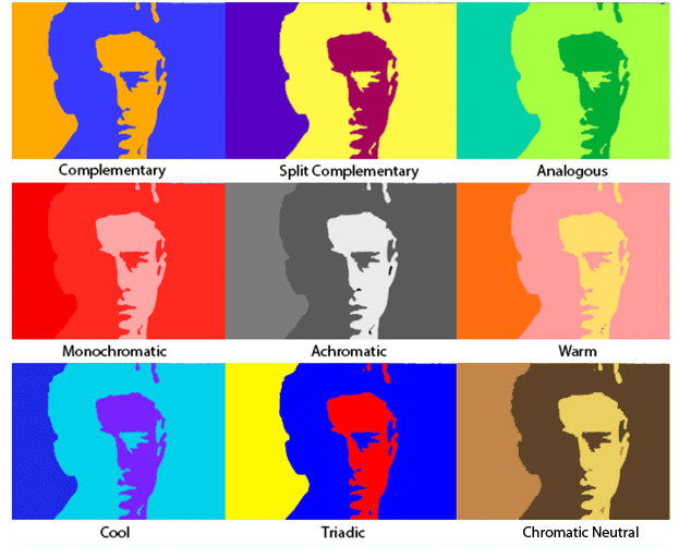
Displaying a different color harmony in each image will create variety.
-
Present a well crafted artwork that demonstrates Photoshop knowledge.

STAGE 1: PLANNING YOUR DESIGN
Brainstorm 4 proposals for your project. Subjects include portraits of celebrities, yourself, your favorite photograph, etc. Look up the art history movement called Pop Art and the artist Andy Warhol to get a feel for this style of art. Decide if you are going to hand draw your images or if you are going to use an original photograph.
FOUR proposals total. They can be in either the format you see up top or the one you see on the right. Try each format at least once. After showing Mr. Jones your proposals, choose which idea you want to use and draw a blank 3x3 grid on a piece of plain copy paper.

5. Decide where each of the following color harmonies will be placed in your composition. The
order is totally up to you. You will use each of these exactly once for nine total. Write down each
one in each box on your piece of paper.
*Refer back to the Color Harmony project if you need to remind yourself!
1. Achromatic
2. Analogous
3. Chromatic Neutral
4. Complementary
5. Cool
6. Monochromatic
7. Split-Complementary
8. Triadic
9. Warm
6. Next to each color harmony title, write down the colors you will use.
STAGE 2: ORGANIZING YOUR DESIGN
1. Go to FILE > NEW and set the size of your document to 8.25 inches by 8.25 inches and 300 Resolution.
2. Ctrl + R to turn rulers on, right click on the ruler that appears on the top of the screen and make sure it is set to INCHES
3. Click and drag from the ruler on the top to the 2.75" mark.
4. Repeat these lines at the 5.5" mark and the 2.75" and 5.5" marks on the sides of your drawing. You should end up with an even 3x3 grid.
5. File > Save As > save this file as "Pop Art" in your :Z drive
6a. If your image is on your phone, upload it to Google Drive
6b. If your image is on the computer, download it to your :Z drive
7. Open your image in Photoshop
8. Use the Crop tool (C), right click inside the selection and choose "1:1 (Square)"
9. Hit Enter when you have the selection you want
10. Ctrl + A, Ctrl + C
11. Switch back to "Pop Art"
12. Ctrl + V, Ctrl + T to fill each box with a picture
STAGE 3: COLORING YOUR DESIGN
-
If your project is an original drawing: use the PAINT BUCKET, EYEDROPPER, MAGIC WAND with various layers with the "multiply" layer effect on top of your drawing to add color.
-
If your project is a photograph: follow the steps below.
-
Use the RECTANGULAR MARQUEE tool to select the first section of your project.
-
Go to IMAGE > ADJUSTMENTS > HUE & SATURATION and turn the saturation to -100
-
Go to IMAGE > ADJUSTMENTS > POSTERIZE and set the levels to 2 or 3 depending on how many colors are in that specific color harmony. Example: Split Complementary = 3, Complementary = 2
-
IMAGE > ADJUSTMENTS > SELECTIVE COLOR
-
Set the METHOD to ABSOLUTE and select either Whites, Neutrals, or Blacks from the drop down menu
-
Play with the sliders to change these achromatic tones to the colors you want.
-
-
Type the color harmony for each section using the Type tool when you're done!
-
Make sure you give Mr. Jones your proposal sheets for your formative grade
